Resources for the 'Space Race' Creative Computing Club.
During this workshop, you will create a quiz program in Python, then investigate data from the Globe at Night project.
This page recaps what we discussed as a group.
We are now going to take a look at some real scientific data, from the Globe at Night project.
This is a citizen science project, which means that people from all over the world - including you! - can take part and add your data.
They ask you to look at the night sky and let them know what you can see - sometimes you can see really faint stars, and other times you can only see the really bright ones.
Light pollution is when there is lots of extra light around, making it difficult to see the night sky. It can effect wildlife and our health, as well as making it harder to observe the stars!
There are lots of reasons why you might get a better view of the sky one day than another. How many reasons can you think of?
The data from the Globe at Night project gives us the limiting magnitude of each observation. Magnitude means how bright a star is, and the limiting magnitude is the dimmest star that you can see at the time.
The higher the number, the fainter stars you can see, meaning you have a better view of the sky. Find out more information on magnitude from the Globe at Night project!
Run this code buy clicking the > button on the top.
You can access this directly on the Trinket website by clicking here.
When you run this code, you get all of the numbers at once... not very easy to work with!
Note - it will take longer to show the results than with your quiz game - this is because there is a lot more data for the program to work through, so the loop takes longer to get to the end of the file!
To make the data easier to understand, we're going to work out the average limiting magnitude per month.
You might have learnt about three types of averages at school, the median, mode and mean. We're going to use the mean to work out the average magnitude per month.
To do this, we add up all of the numbers, then divide by the number of numbers! To find out more, check out this BBC Bitesize page.
The Python way of writing this is:
averageMarch = sum(data.Mar)/len(data.Mar)
print(averageMarch)
averageMarchsum (add up) all the numbers from data.Mar (March)len (length of, i.e. the number of numbers) of data.Marprint() this value, so we can see it on the screenAdd this new code to your program, underneath everything that's already there, and test it out!
Can you change it to get the average of a different month instead?
Don't worry about doing all the months - we can use a programming trick to do them all at once!
We can use a loop to tell the program to do all the months at once, without having to type out all the lines again!
We're going to use the same kind of loop as the one we used to read all the quiz questions - a for loop.
Replace the two lines of code you used to get the average with this:
averages = []
for month in data.list:
  averages.append(sum(month)/len(month))
print(averages)
This does the same thing, but it does it for every month in the data, and adds them to a new list called averages.
You just have one number now for each month, compared to all of the ones you had before... much easier to work with!
Try changing the year, stars and location variables to see what numbers you get.
"all" for now.If you choose a specific constellation, such as Orion, they can only be seen in the sky at certain times of the year. This means that for some months, there will be no data for this constellation.
This means that the program will try to create an average from nothing, and will get confused!
If you want to fix this error, follow the instructions here, or switch back to "all" and change a different variable instead.
The averages are easier to compare than all the numbers we had before, but a graph is even better!
Add this code to your program, underneath everything you have done so far:
plt.plot(months, averages, color="red")
plt.show()
What do you want to visualise?
The graph will show you the averages using the variables you chose before.
You can improve your graphs by adding labels, to explain what you are showing, and by adding more than one line to compare them.
Think about what interests you - what questions do you want to ask?
Use the extensions links below to help you add extra things to your graph, or go back to your quiz from earlier and add extra features to that instead!
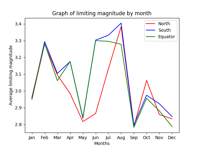
I chose to compare the average magnitude of the Northern & Southern hemispheres, as well as around the Equator (the middle of the globe!).
I put labels on my graph so that you can see which colour is which.
I notice that the average magnitude is lowest in May and September, and highest in February and August - this could mean that people could see the sky more clearly in February and August than at other times of the year.
Why could this be? And is the difference in numbers big enough to be important? My graph doesn't give the whole picture.
A research scientist could look at this graph and decide to look more closely at the data to see if there is anything different about these months, or decide to do more research!
A few ideas of things to add to your graphs are below - or ask us for help to implement your own ideas!
Click here to find the ideas for extending your quiz instead.